
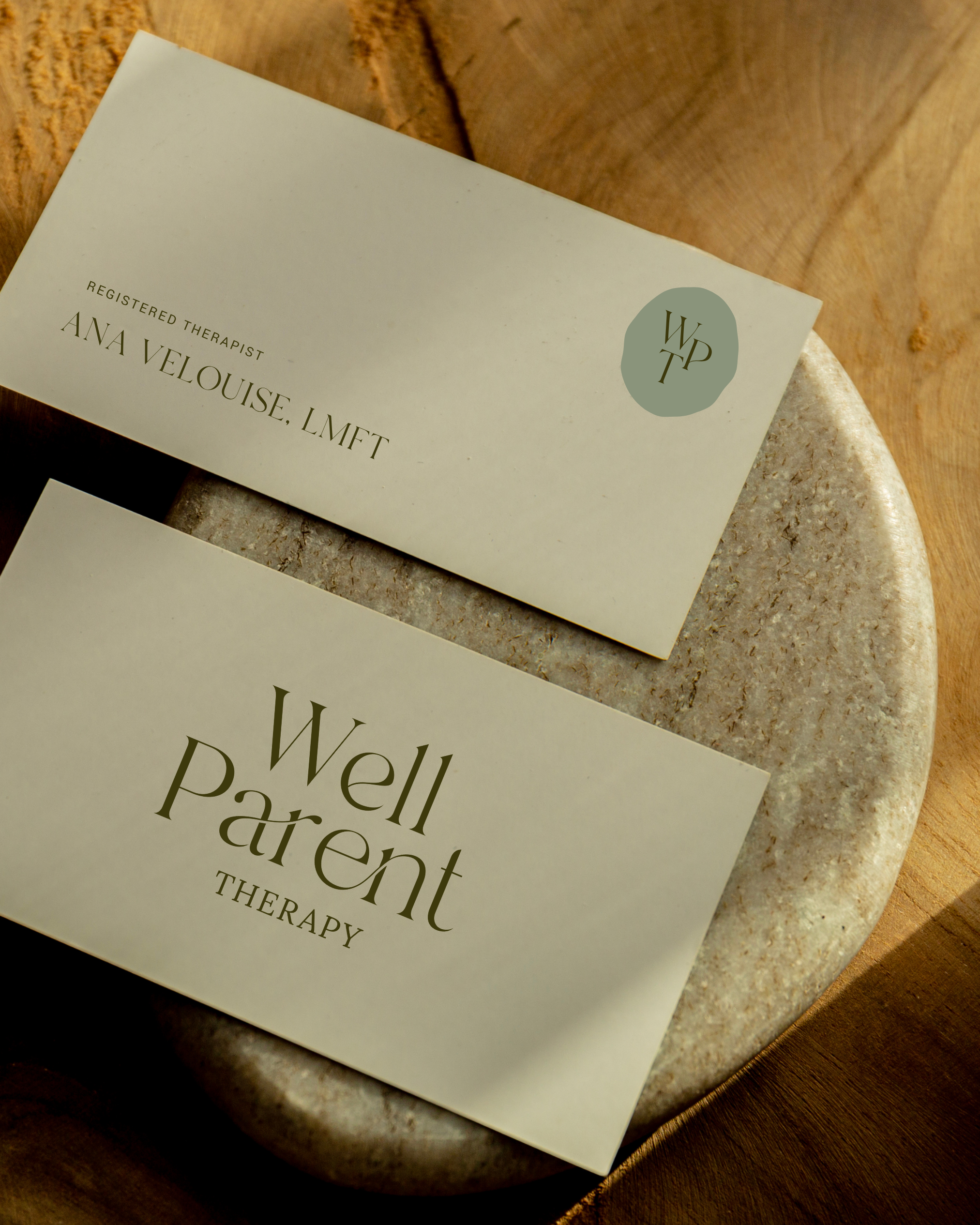
Well Parent Therapy
Well Parent Therapy offers Fertility, Pregnancy Loss, and Postpartum Therapy in Los Angeles & Pasadena, CA.
SCOPE: BRANDING / WEB DESIGN / STRATEGY

THE OUTCOME
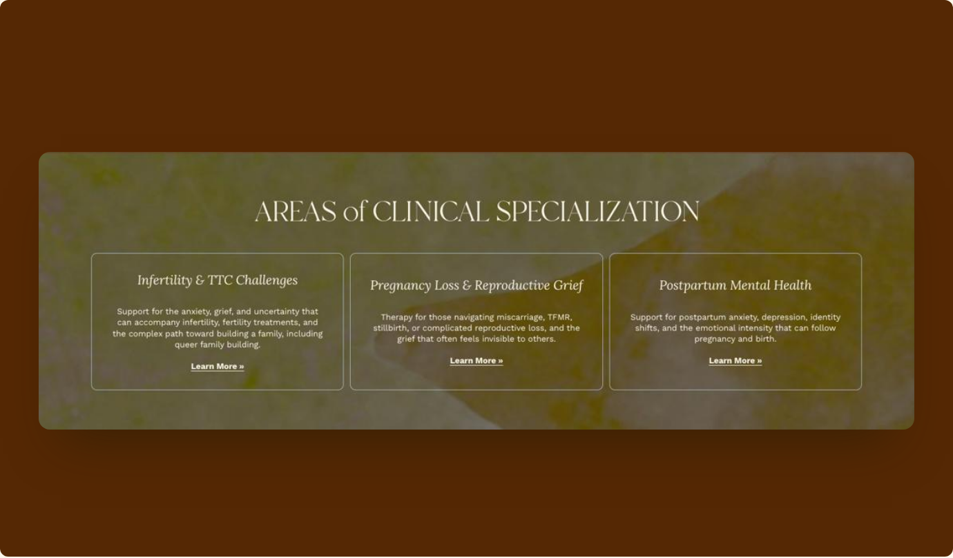
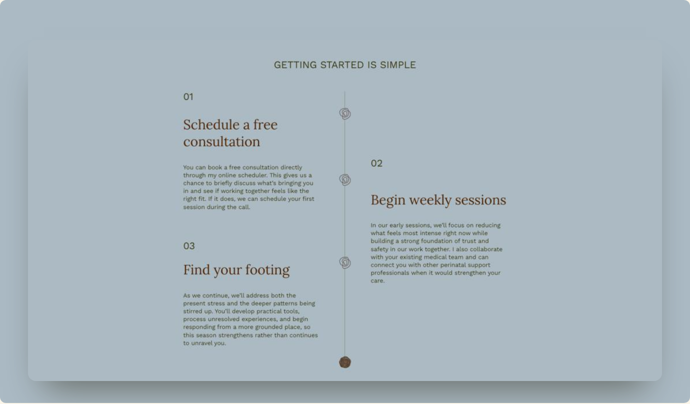
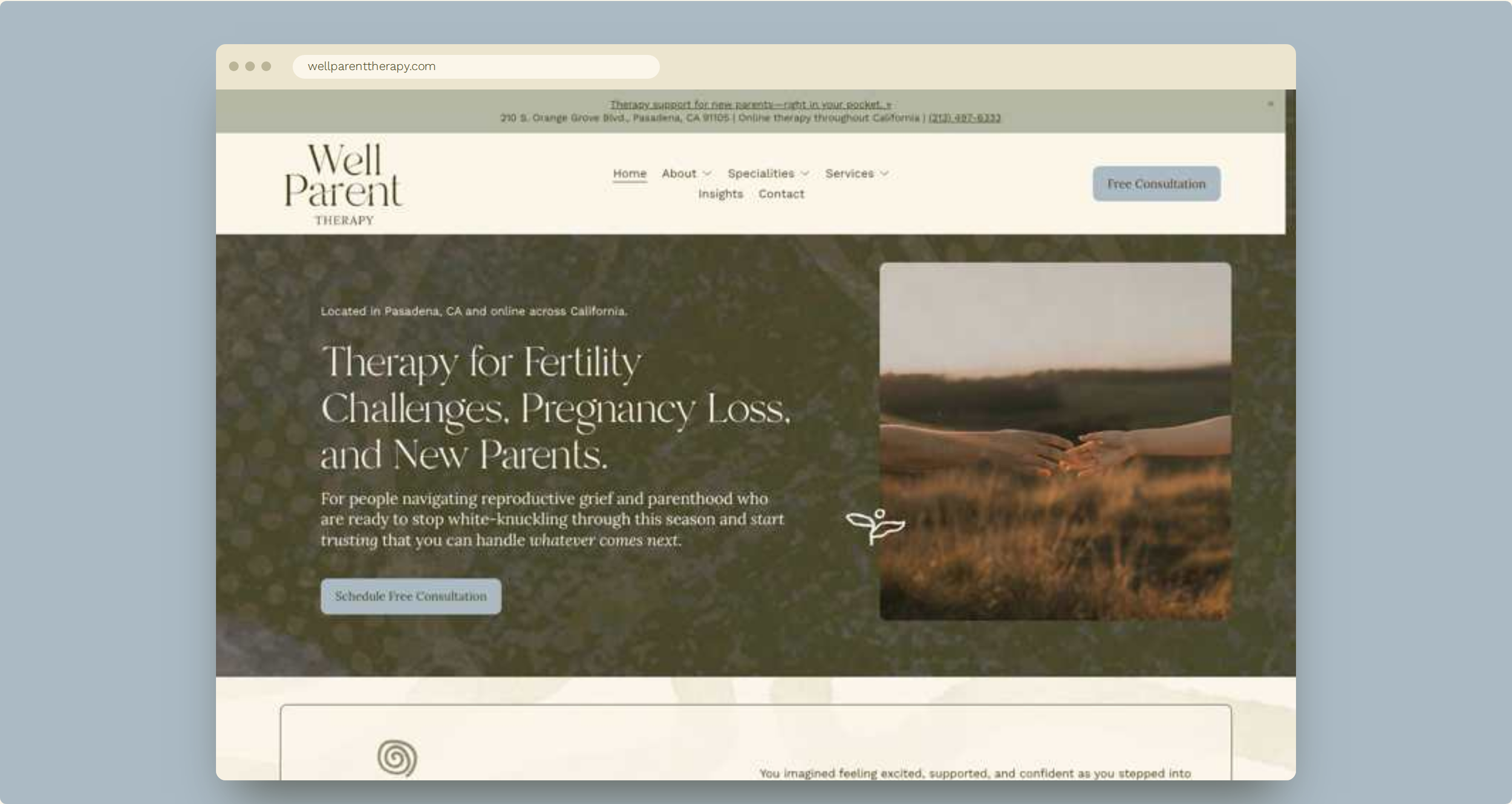
Well Parent Therapy helps people navigate the messy, complicated, and deeply personal realities of becoming a parent. The identity aims to signal warmth, calm and professionalism at once, so it should help the practice feel approachable without seeming casual about the clinical work. The website clearly separates the different areas of support, allowing visitors to recognize their own experience within the practice. This is particularly important for Well Parent Therapy because its specialization is part of what distinguishes it from a general therapy practice.

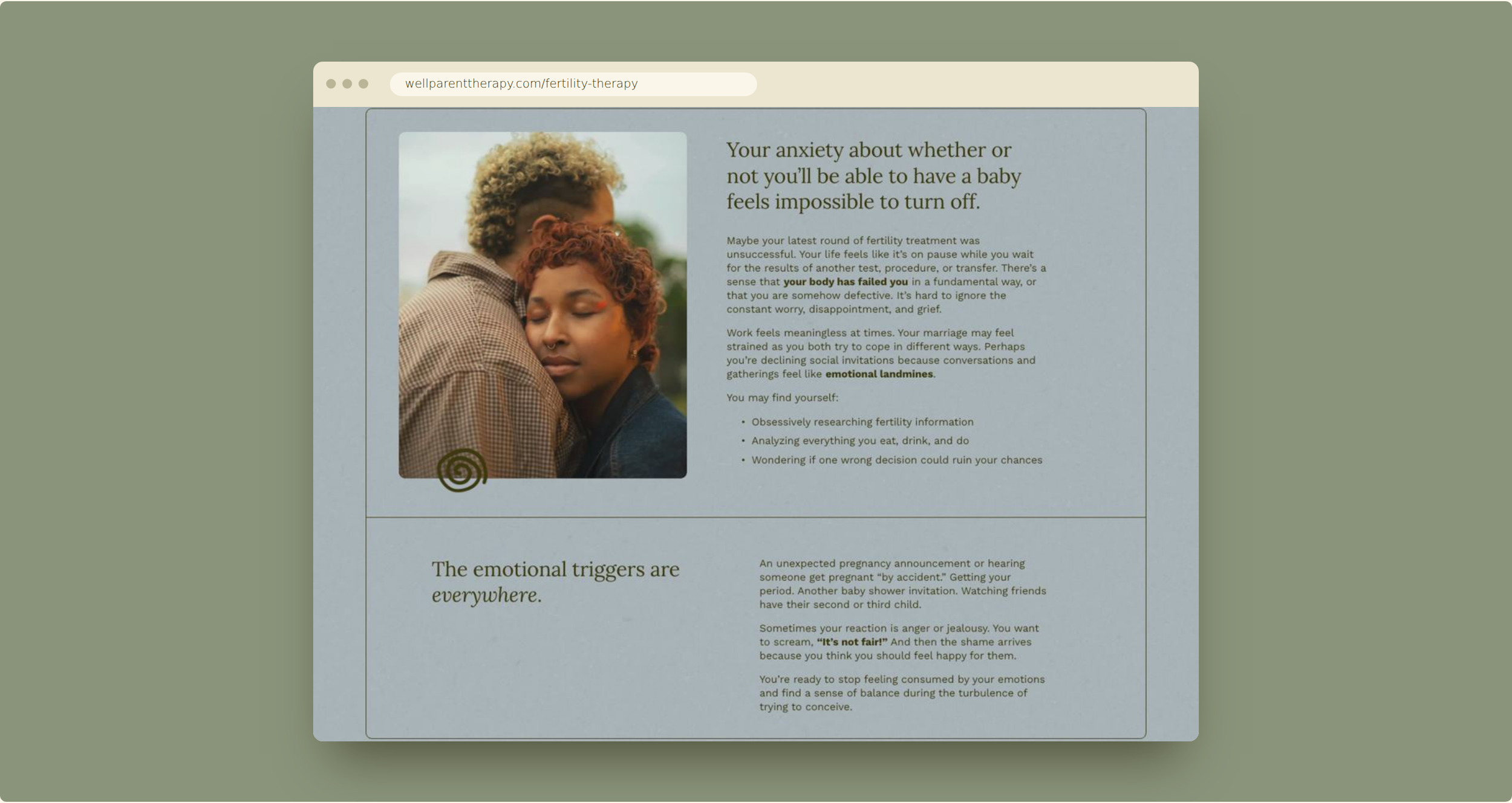
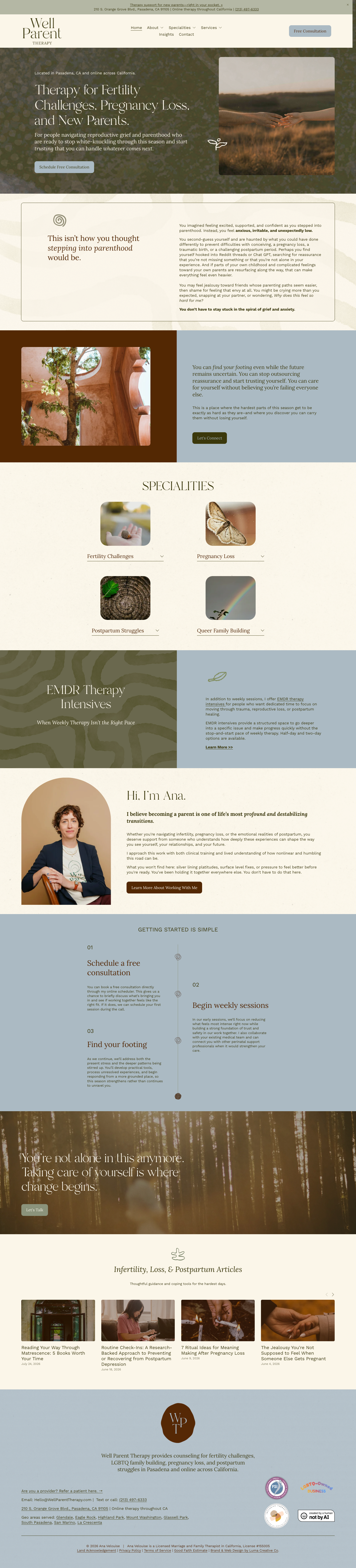
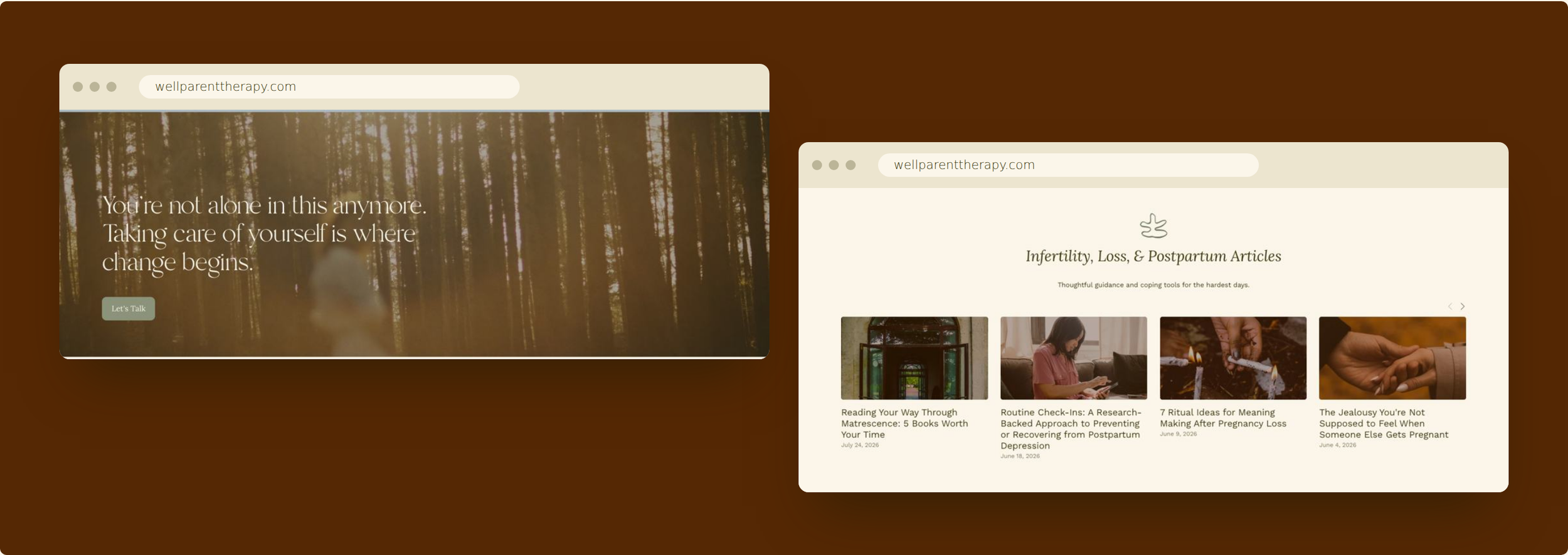
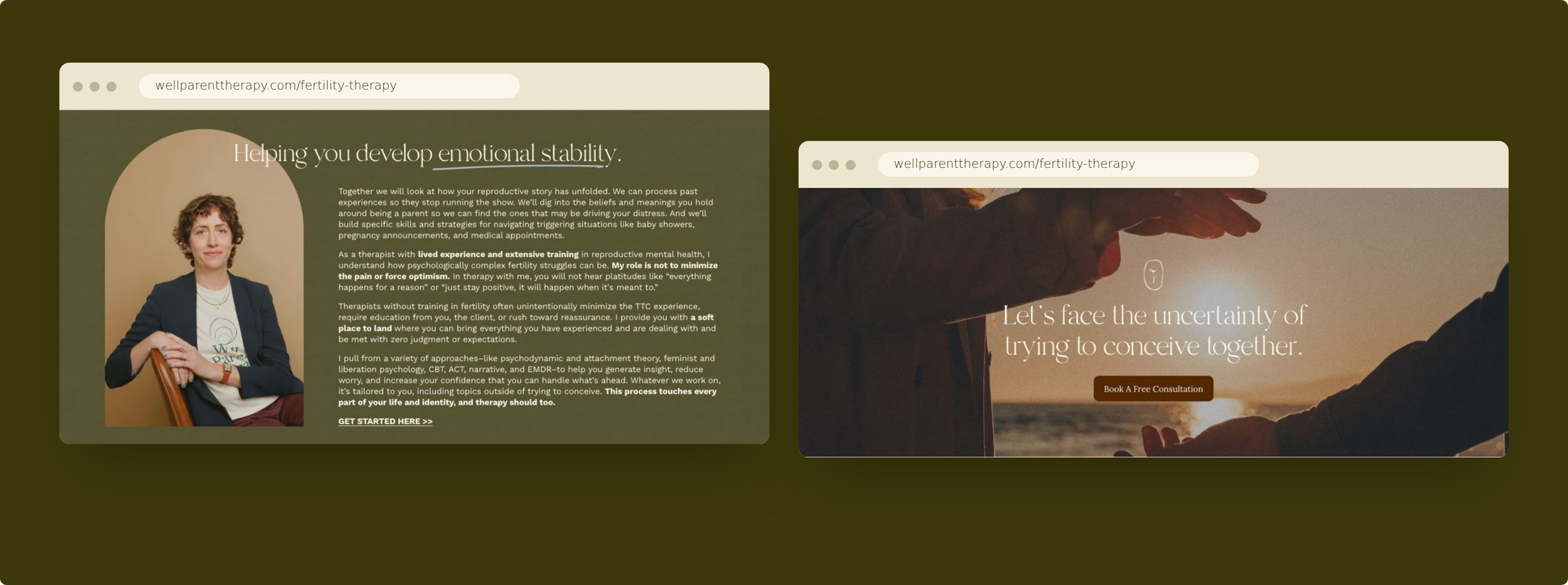
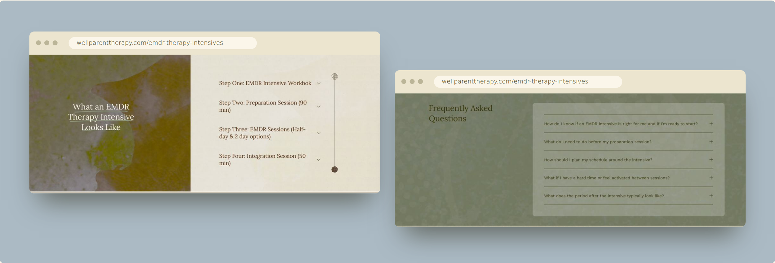
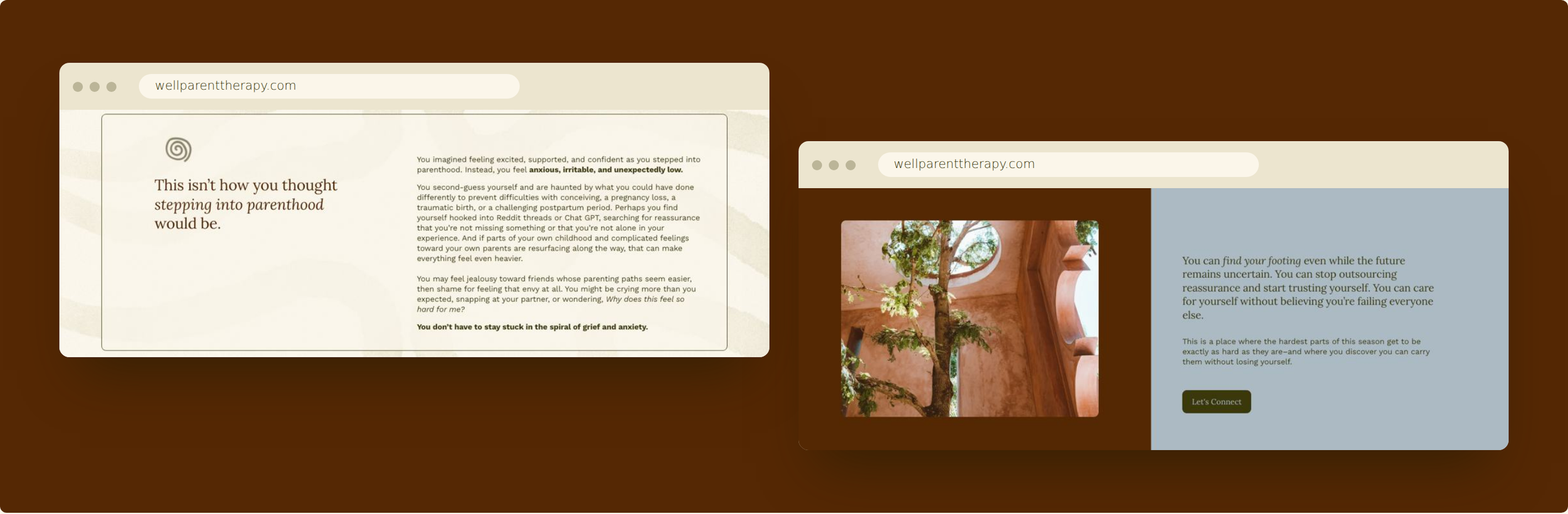
The brand feels:
Warm → you feel welcomed
Grounded → you feel steadied
Compassionate → you feel understood
Specialized → you feel you're in knowledgeable hands
Non-judgmental → you feel safe bringing the complicated stuff
Hopeful → you feel there is a way forward
The branding outcome
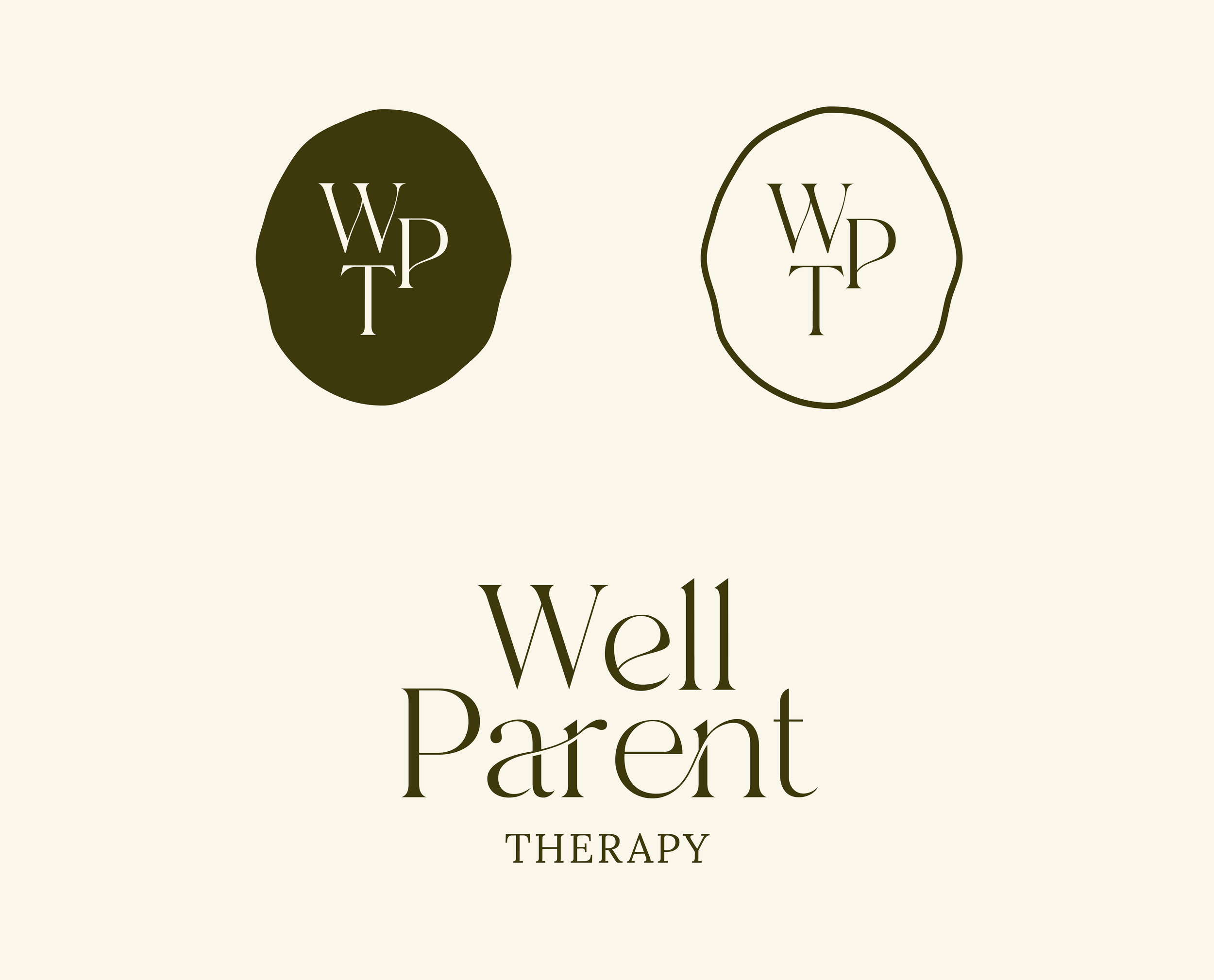
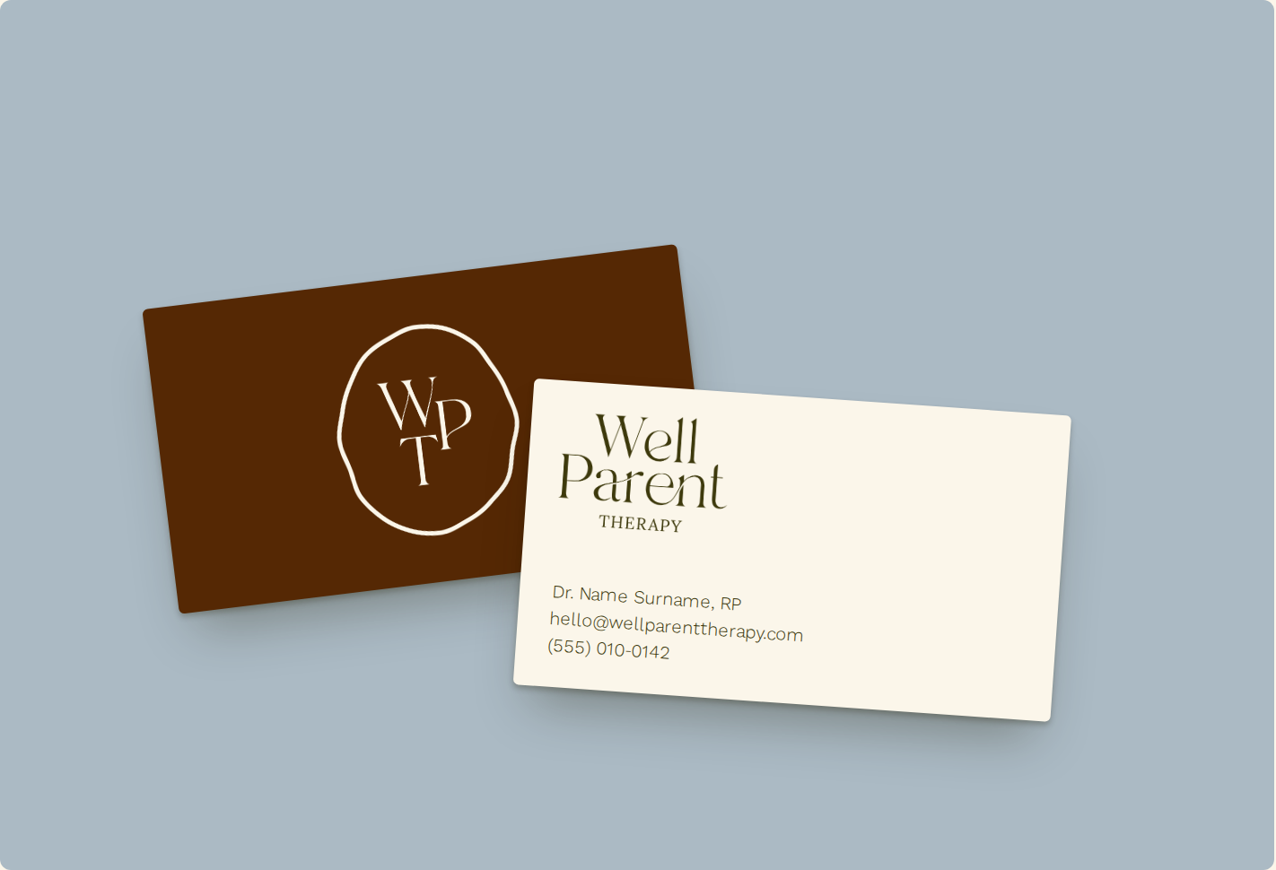
The rebrand gives Well Parent Therapy a complete, flexible system rather than just a logo:
Three logo tiers. The stacked primary wordmark suits hero moments, the horizontal secondary logo fits navs and letterheads, and the WPT seals work at small sizes like avatars, stickers and social icons.
A distinctive wordmark. The thin swash that loops through the "a" and runs into "ent" ties the letters together into one continuous line. It reads as connection, which suits a practice built around parents.
Organic seals. The hand-drawn, slightly irregular blob shapes feel human rather than corporate or clinical.
A grounded palette. Olive and maroon anchor the brand, with sky, sage and cream softening it. The colors are earthy and calm, and they steer away from both the cold clinical blues of many therapy practices and the pastel baby palettes of parenting brands.